Since 9 October 2026, emirbalin.com has been live with a new design. The address is the same, and so is most of the content. What changed is how the site is built and managed.
This post is about the redesign: why I changed the site, how the design came together and how I worked with Claude. At the end, I list what is done and what comes next.
Why I changed it
The old site was built with SvelteKit, a software framework for making websites. The problem: every small update meant code. To add a project or fix a sentence, I had to open the files, edit them and publish the site again.
I wanted three things:
- An admin panel. Change content, menus and contact details in the browser, without code.
- Two languages. Linked Turkish and English pages, with a one-click language switch.
- Good search results. A title, description and sharing image for every page, and a sitemap that updates itself. A sitemap is a list of pages that helps search engines find them.
I could add these to the old site one by one. But each one meant more code, and I would be back where I started.
Why WordPress
I chose WordPress for its admin panel. Posts, pages, menus and images are all in one place. But I did not use a paid ready-made theme or a drag-and-drop page builder. I wanted to know how every part of my site works.
So I wrote my own theme, in two layers. The bottom layer holds the shared colours, fonts and the light/dark switch. The top layer holds the templates for emirbalin.com only. I split it this way because another site will use the same base later.
I also decided early what the panel can change. I can edit the content, the menu, contact and social media details, the order and visibility of home page sections, and the ready colour options. The section designs are locked; templates live only in the code. So a wrong click in the panel cannot break the design.
The home page has eight sections: a full-screen photo, a short “about me”, a timeline for experience and education, projects, skills grouped by topic, references, latest posts and contact. A section with nothing to show, like references for now, does not appear.
How the redesign came together
I started with a light background, a home page led by a photo, and magazine-style type. I avoided a very common look on purpose: a dark background with glowing cyan and frosted glass.
Colours
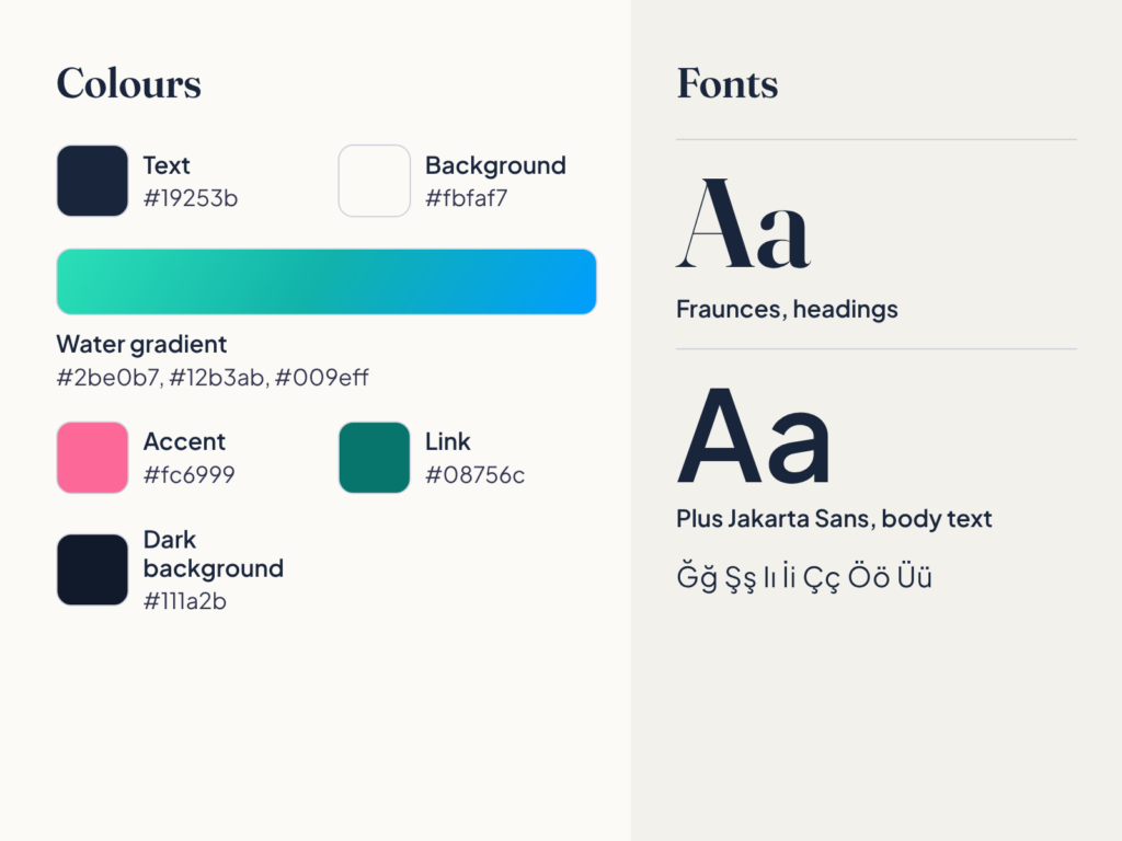
Text is dark navy (#19253b). The background is a warm off-white (#fbfaf7). The main colour is a “water” gradient from turquoise to blue (#2be0b7, #12b3ab, #009eff). For accents I used a little pink (#fc6999). A second ready palette can be chosen in the panel; it uses sunny tones instead of pink.
My rule: bright colours are never text colours. For anything people read, like links, I used darker versions. The link colour, for example, is a dark turquoise (#08756c). This keeps text clearly separate from the background.
Fonts
Headings use Fraunces; body text uses Plus Jakarta Sans. Fraunces gives headings character, and Jakarta is easy to read in long text. I host both on my own server. To keep the files small, I load only the weights I use and the characters Turkish needs. I checked that all Turkish letters (ğ, ş, ı, İ, ç, ö, ü) look right.
The EB seal
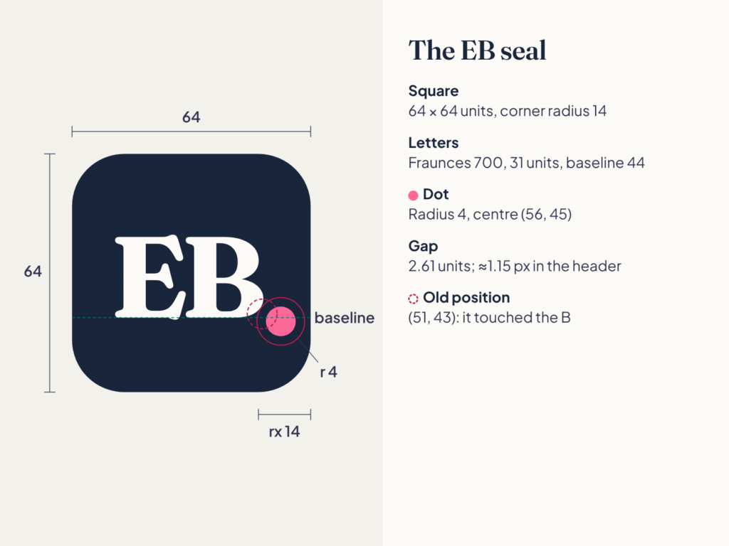
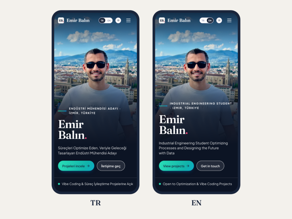
The header logo is “EB” in Fraunces inside a navy rounded square, with a small pink dot in the bottom right corner. The dot used to sit at the end of my name. Now it lives in the seal.
At first, the dot touched the curve of the B. On screen it was about one pixel, but I noticed it. I moved the dot a little right and down, so now there is a thin gap. The small icon in the browser tab is a simpler version of the seal: one letter E and the same pink dot.
Light and dark theme
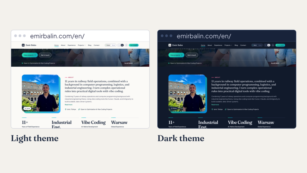
The site opens in the light theme. A header button switches to dark, and the browser remembers your choice. In the dark theme the background is deep navy (#111a2b), and link and accent colours are adjusted to stay readable. The page does not flash white before turning dark, because the theme is applied before the first paint.
The header
On the home page, the header starts transparent over the photo. It hides when you scroll down and comes back with a solid background when you scroll up. The seal changes colour with it: light over the dark photo, navy on the solid background. On the right are the language switch, the theme button and a “Get in touch” button.
In the experience and education section, the timeline line draws as you scroll and the cards open one by one.
Animations change only the look, never the content. If your device has “reduce motion” on, they are all off. There is a short effect between pages; browsers without support just open the page. There is no full-screen “loading” screen.
The footer keeps the old site’s layout with the new look. On blog posts, a small “about me” card stays on the right on desktop and moves below the post on phones.
How I worked with Claude
I built this site with Claude, an AI assistant. This is called “vibe coding”: you describe what you want in plain words, and the AI writes the code. It sounds easy, but most of the work is being clear about what you want.
I set four rules:
- Plan, approve, then small steps. I split the work into rounds. In each round I read the plan, approved it and reviewed the changes in small pieces.
- Prototype first. Before the theme, I made a static prototype. I compared two colour sets and two font pairs side by side and decided there.
- Measure, do not guess. I did not trust words like “fast” or “accessible”. I had automatic tests written for contrast, keyboard use and accessibility, and ran them after changes.
- I make the decisions. Claude wrote the options and reasons. I decided which colour stays and which feature waits.
This taught me that good work with AI starts with a good task description. The planning, the checks and the final word stayed with me, so the result is my own.
A small example: before going live, I changed nine places in the English texts from “Turkey” to “Türkiye”. The rule was mine. Finding and fixing them was Claude’s job. Then I checked the result.
What I aimed for, what I did, what comes next
My aim was a simple personal site in two languages that I can manage myself. I also moved it to my own server, on a safer and faster setup.
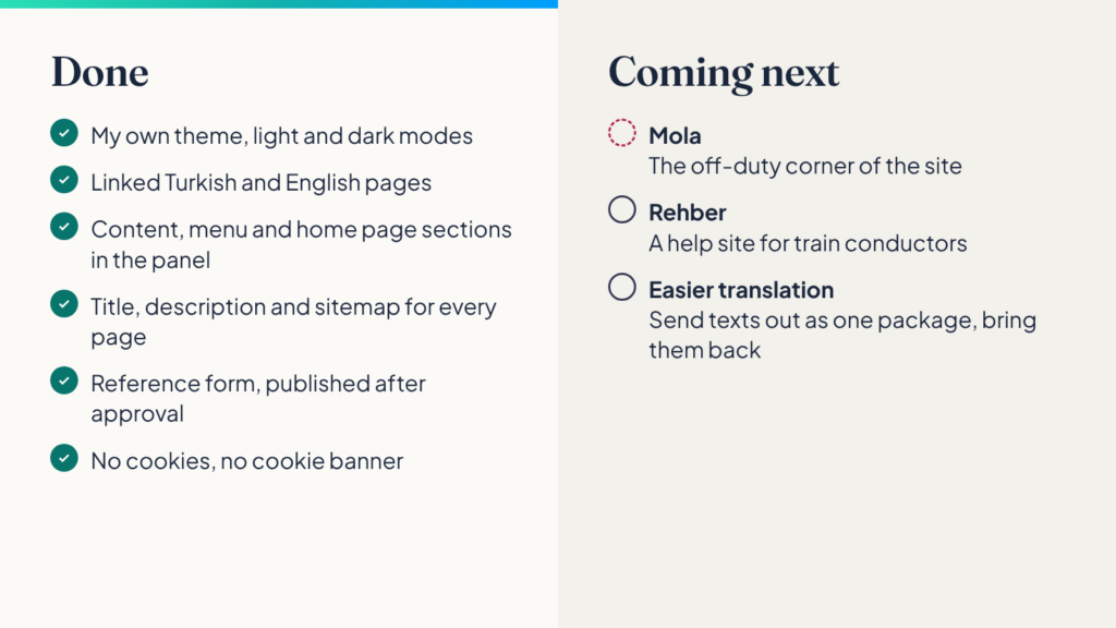
Done:
- My own theme, with light and dark modes
- Linked Turkish and English pages
- Content, menu and home page sections managed from the panel
- A title, description and sitemap for every page
- A reference form, published only after my approval
- No cookies, so no cookie banner
I built the reference form with care. The consent box for KVKK, Türkiye’s data protection law, is required. Each reference comes to me first and is published only after I approve it. I do not share form data, and the notice I receive has no personal data.
Not everything is finished. I wanted a solid base first, so some work waits. Coming next:
- Mola: the “off-duty” corner of the site
- Rehber: a help site for train conductors (more in a separate post)
- Easier translation: sending Turkish texts from the panel for translation as one package and bringing them back
Mola: work in progress
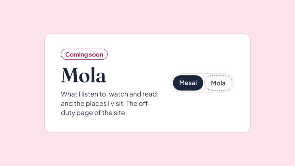
In the header there is a small switch that says “Mesai / Mola” (“work / break”). For now it says “coming soon”. Mola will be the off-duty page of the site, where I share what I listen to, watch and read, and the places I visit. The switch will turn the site into a more playful colour mode. The design is approved and the base is ready. I need to finish a few checks first. Coming soon.
Take a look
The project pages show the new design best. I also built the TCDD Tariff System with vibe coding. All my work is on the Projects page.
If we have worked together, I would be very happy if you wrote a short reference. References appear after I approve them.